Stash Brand Design
Brand Design and UI/UX Design Case Study
The goal of this project is to design a brand identity for Stash, which is a innovative social lending startup from Sydney.


The goal of this project is to design a brand identity for Stash, which is a innovative social lending startup from Sydney.
Create a design solution that addresses the lack of inclusive and visually engaging brand identities in the lending industry.
Design should effectively combine cutting-edge technology, transparency, and a strong sense of community to empower the youth.
The company can differentiate itself by creating a more encompassing brand approach that broadens its customer base and enhances its image.

I did a simple brand audit by getting the client to fill out a standard brand questionnaire. I got detailed feedback which helped me to narrow down my design path.
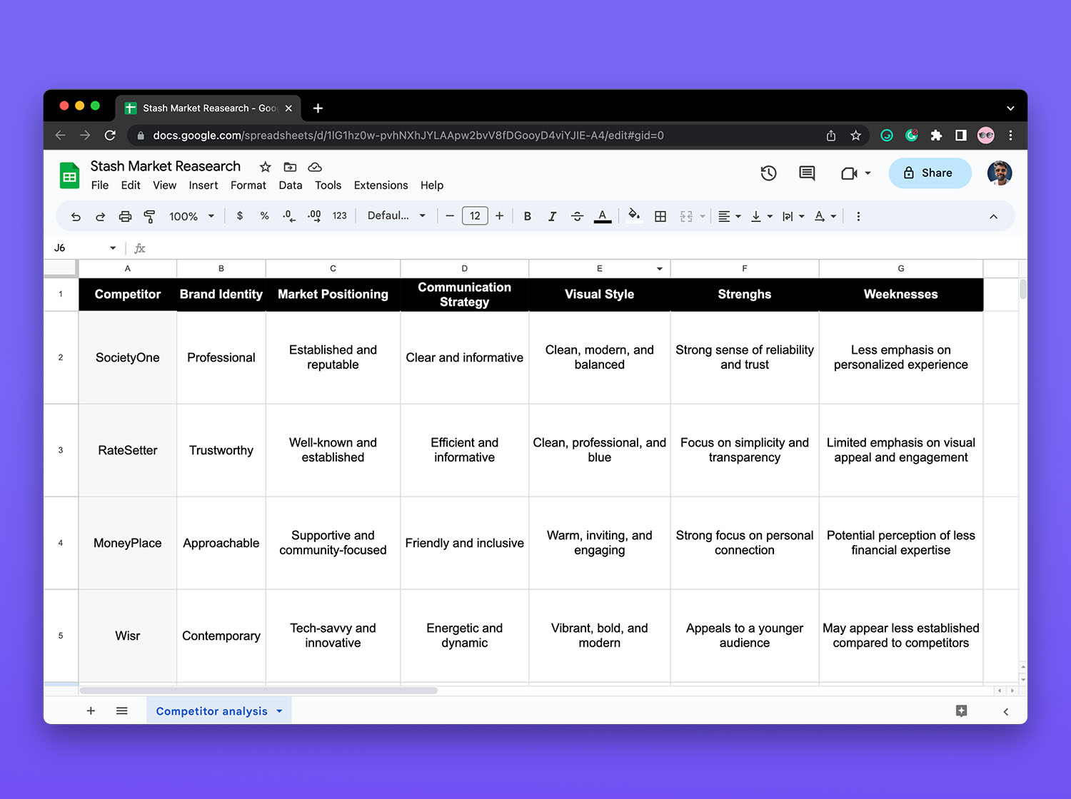
Then I conducted a brief market research to gain insights into the finance industry landscape, market trends and competitor analysis. I recorded my findings in a simple Google doc so I can organise all the findings in one place.
Based on the data I gathered during the research and analysis phase I developed and refined the Stash brand strategy. I scheduled a few meetings with founders to make sure I am on the correct path.
Stash is positioned as the leading peer-to-peer lending platform for the youth.
Stash is accessible, innovative, trustworthy, and community-oriented.
Stash delivers personalised borrowing through cutting-edge tech, transparency, and community. Targeted at 18-35-year-olds, the brand offers a user-friendly digital platform for tech-savvy customers.
I then started sketching on my iPad for initial concepts. Then switched to Illustrator to create some of the ideas I thought would work.
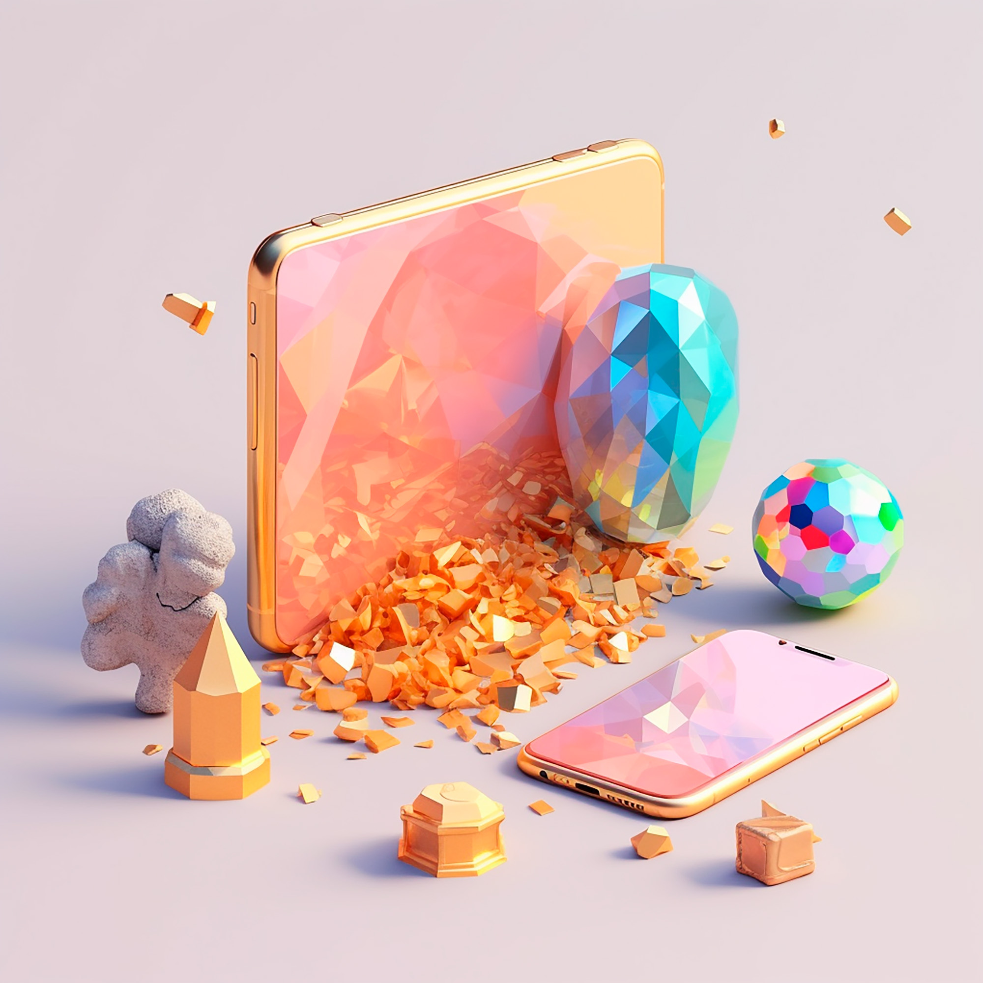
I created a modern logo and used a very vibrant colour palette as it connected with the target audience. Then I used the AI tool Mid Journey to create graphic elements which I thoroughly enjoyed
The logo design for Stash draws inspiration from the concept of a sealed jar. This design concept symbolises the idea of storing and safeguarding financial resources, reflecting the platform's commitment to secure and responsible lending practices.
The inspiration behind the sealed jar comes from the notion of keeping one's valuable possessions safe and accessible, aligning with the mission of empowering the youth to manage their finances and unlock their potential.

I picked bright green and purple as primary and secondary colours. These colours are very vibrant and youthful which aligns very well with Stash’s brand attributes. Bright green is often associated with growth and prosperity and this emphasises Stash’s mission. Then I used Google material design to help me develop a colour system


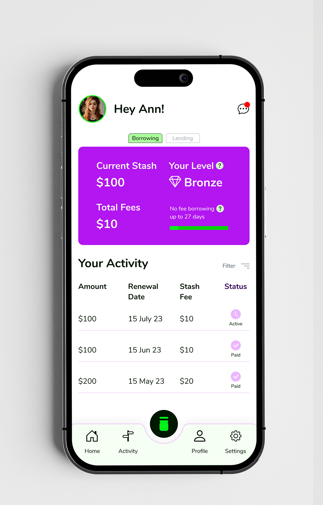
In the development of "Stash", a streamlined micro-lending platform, a pivotal role was played by its intuitive and user-centric UI/UX design, crafted meticulously to ensure a seamless and straightforward user journey through the complex processes of lending and borrowing.


The client was very happy with the look we created. This is the first time I’ve incorporated AI tools in my workflow and I am very happy with the results I got. Combining Midjourney with Photoshop AI allowed me to extend my skills and I will definitely use this workflow in my future design projects.