Brolly Brand Design
Brand Redesign and UI/UX Design Case Study
The goal of this project is to re-design brand identity of Brolly, which is a peer to peer lending lending and borrowing start-up in Australia.


The goal of this project is to re-design brand identity of Brolly, which is a peer to peer lending lending and borrowing start-up in Australia.
Re-create the Brolly brand so it can position itself in the finance industry while also appealing to young, tech-driven users.
The design should blend a nostalgic 90s aesthetic with modern design principles, symbolising a rebirth rooted in both tradition and innovation.
To stand out, Brolly needed to balance an energetic, modern feel with a bold, trustworthy identity. Appealing to young but informed users while maintaining credibility with sophisticated investors.

I utilised original research data to refine Brolly’s brand strategy, ensuring it remained competitive while embracing a stronger, more defined positioning. The goal was to modernise its identity, strengthen trust, and create an engaging experience that resonates with both tech-savvy users and seasoned investors.
Brolly is positioned as a secure, forward-thinking peer-to-peer lending platform that merges financial credibility with cutting-edge technology. It appeals to Millennials and older Gen-Z users who value both trust and innovation in their financial choices.
Brolly embodies confidence, innovation, and reliability while fostering a strong sense of community-driven finance.
Brolly delivers a seamless borrowing and lending experience through transparent, AI-driven processes that simplify access to financial opportunities.
Brolly’s identity merges retro aesthetics with modern tech, inspired by the DeLorean from Back to the Future. I started with AI-generated concept art of futuristic DeLorean-like cars to explore this fusion
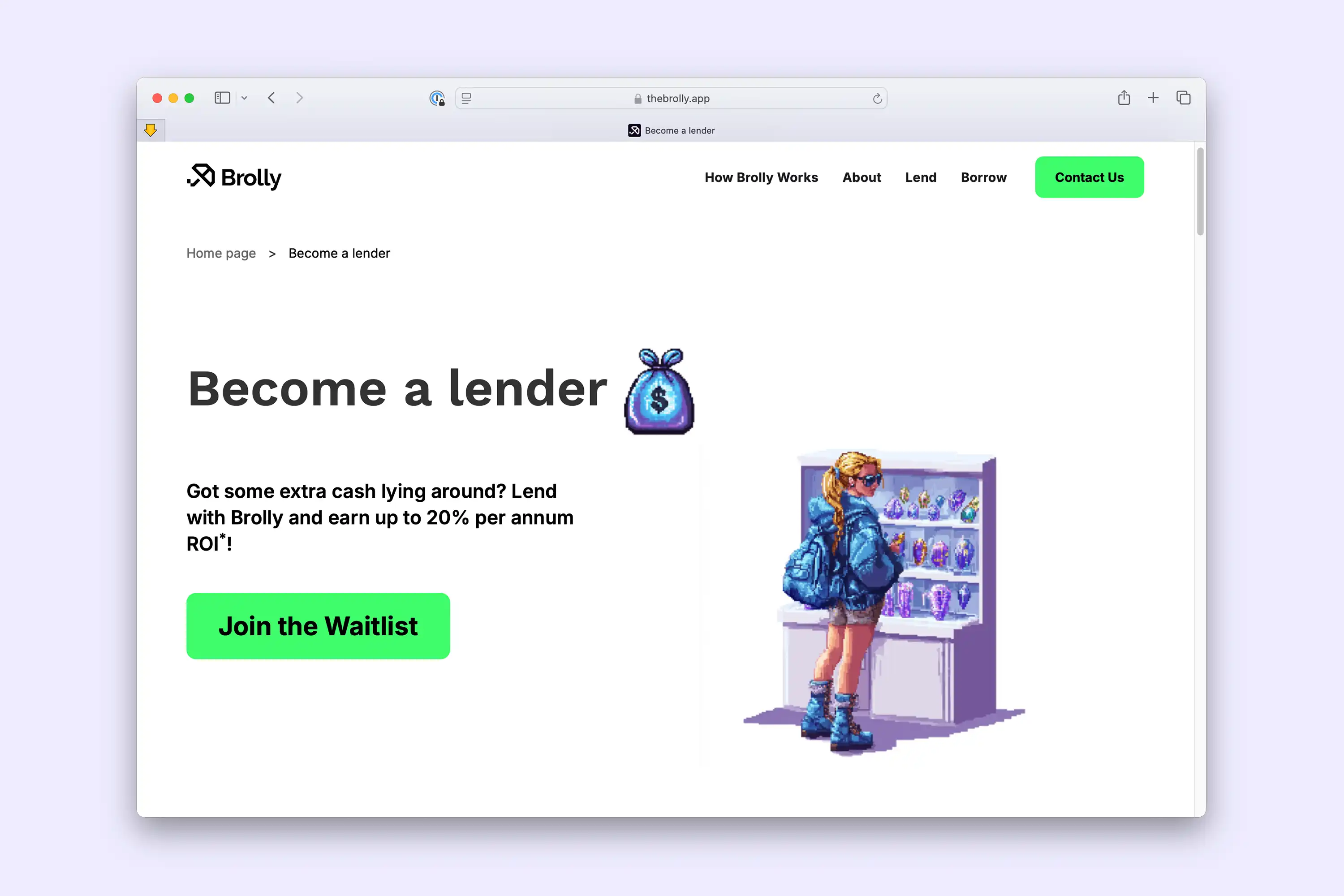
I designed pixel-art futuristic characters to add personality and reinforce Brolly’s identity. These became core brand elements, bringing a tech-savvy and community-driven feel.
The Brolly Car, symbolising the app, was first planned in pixel art. To ensure consistency across different settings, I switched to a 3D model in Blender.
I designed a modern, future-forward logo that embodies Brolly’s mission of blending trust, innovation, and technology. The visual identity balances bold simplicity with tech-inspired precision, ensuring strong brand recognition across both digital and real-world applications.
The Brolly logo mark is a stylised, minimalistic umbrella with a pixel-inspired cut, representing both protection and digital evolution. This symbol reflects Brolly’s core purpose providing security in lending while embracing the future of finance. The geometric form enhances scalability and clarity, making it adaptable across all brand touchpoints
The typography is clean, modern, and slightly rounded, reinforcing a friendly yet professional tone. The colour palette of green and violet balances growth and trust with a sense of futuristic dynamism, aligning with Brolly’s innovative fintech approach

I kept the green and violet colour palette from the original, as it connects well with the new Brolly brand. These bright and vibrant colours create a youthful and energetic vibe, aligning with Brolly’s fresh, innovative approach


I redesigned the Brolly app to align with the new brand identity, focusing on clarity, usability, and consistency. This involved a complete overhaul of modules, icons, and information structure, ensuring a seamless and intuitive user experience


The new brand identity, pixel art, and AI-generated assets were well received by the client, target audience, and investors. The refreshed, professional look helped Brolly stand out in the fintech space, securing another round of funding. The founders were extremely happy with how the brand evolution strengthened their market presence and investor appeal.